

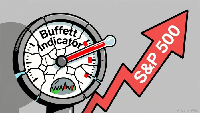
The Buffett Indicator - the ratio of total US stock market capitalization to US GDP - is at roughly 230%. That's the highest reading in the history of the metric. By the logic of every article that has pasted a red-trending chart and called it analysis, we should be living in a margin call.
Instead, the S&P 500 keeps printing new highs. The indicator has been flashing "bubble" for four years. The market treated it as wallpaper.
That's not a coincidence. The metric was broken when it broke - and it's been broken longer than the people who scream about it every quarter care to admit.
The denominator doesn't do what you think it does
The Buffett Indicator divides the total market value of US-listed stocks by US GDP. The theory is elegant: if the stock market is larger than the economy that supposedly supports it, something is wrong.
Except the denominator - GDP - only captures economic activity within US borders. The numerator - market cap - values companies that earn a massive and growing share of revenue overseas. Nvidia sells GPUs globally. Apple sells iPhones globally. Microsoft runs cloud infrastructure globally. These companies' market caps are priced on worldwide earnings power, not domestic economic output.
CFA Institute research has flagged this since 2021: market cap-to-GDP ratios are "highly inaccurate" precisely because US multinationals generate trillions in foreign revenue that GDP never sees. The ratio inflates mechanically as the international share of corporate earnings grows - not because the market is irrational, but because the denominator is measuring the wrong universe.
A ratio of 230% sounds like a screaming alarm until you realize half of that premium is measuring revenue the denominator was never designed to capture. It is not as good as it looks - because it was never measuring what its defenders claim it measures.
Concentration is the real story this metric won't tell you
Here's what the Buffett Indicator tells you: the aggregate US stock market is expensive. Here's what it won't tell you: which companies make it expensive, and whether you actually own them.
Just 13 companies now make up over 40% of the S&P 500 by market cap. The top 10 represent roughly 41% of index weight. The Buffett Indicator is, in effect, a Nvidia-AAPL-MSFT-AMZN weighted alarm bell. If you don't own a broad-market index, the number is decorative.
That concentration also means the indicator can't distinguish between a market driven by five AI infrastructure companies posting real earnings growth and a market propped up by speculative froth in the 487 names behind them. Both scenarios produce the same ratio. They demand entirely different portfolio responses.
An aggregate valuation metric that can't tell you which half of the market is carrying the other half is not a tool. It's a mood ring.
The Shiller CAPE has the same problem - and a worse one
If you want a harder number, the Shiller CAPE ratio (the price-to-earnings ratio based on ten years of inflation-adjusted earnings) is at roughly 41.8 in May 2026. The long-run average is near 17.3. Only the December 1999 dot-com peak was higher.
The CAPE has its own structural headwind: ten-year backward-looking earnings are a terrible input when you're pricing companies whose earnings are accelerating right now. A metric built on trailing averages is structurally biased against growth regimes. When AI-related earnings power genuinely rewrites what a semiconductor company or a cloud provider can earn in 2027 and 2028, a ten-year average is looking in the rearview mirror and telling you the road ahead is flat.
Neither the Buffett Indicator nor the CAPE answers the question that matters: whether the companies you own can sustain the earnings that justify their current price.
The real test is per-company, not per-economy
The cross-currents are three. First, the Buffett Indicator's structural distortion from foreign revenue means its absolute level is less alarming than it appears. Second, extreme concentration means aggregate metrics are proxying for a handful of mega-cap valuations, not a broad market thesis. Third, even if the metric is valid as a long-term warning - and there's evidence it was elevated before the 2022 drawdown - it is useless as a timing signal, because the market sat at "bubble" levels for years without breaking.
Directionally, the evidence suggests that anyone using the Buffett Indicator to decide whether to stay in or get out of the stock market is using a thermometer to navigate a car. It measures temperature, not direction.
The investor-grade work starts at the company level. Can the semiconductor supplier ship the product on the roadmap date, or has the timeline slipped again? Is the cloud provider's margin expansion from pricing power or cost-cutting that caps upside? Does the mega-cap's valuation require perfection for the next three years, or is there an error margin?
Those are questions about engineering execution, cost structure, and competitive moat - not about whether the total market cap divided by GDP has crossed some arbitrary threshold for the 48th consecutive quarter.
You decide which was marketing fluff and which one was analysis.